This Product doesn't exist: Building products super fast
Last year I was obsessed with Generative Art - that's art that is generated using only algorithms.
In the image below, I forced an algorithm to draw me (yes, that's me) having learnt only about triangles. If you want to see more impressive art you should check out Tyler Hobbs and this sub-Reddit.
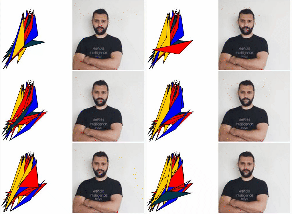
But how do we perceive shapes and ideas when we are forced to limit ourselves? Can we extract the basics of a product by eliminating the unnecessary?
This bicycle does not exist
If you go to ThisPersonDoesNotExist and you keep refreshing the page, you will see every time a photo of person that doesn't exist. That photo has been generated by a Machine Learning algorithm that mashes millions of photos together and comes up with a new face every time.
A friend of mine introduced me to Velocipedia, a project where people are asked to draw bicycles from memory.
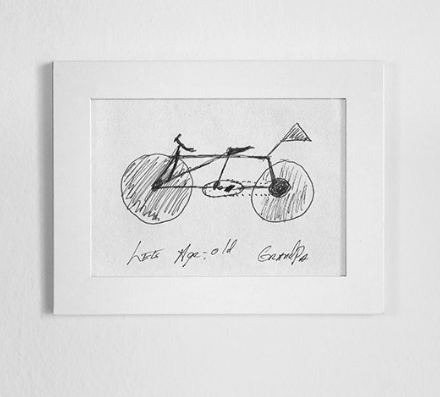
The majority of the bicycles drawn have some vital flows. These bicycles cannot exist.
As Gianluca Gimini says:
Little I knew this is actually a test that psychologists use to demonstrate how our brain sometimes tricks us into thinking we know something even though we don't.
How about we do this for building products?
This Product Does Not Exist
For the last couple of months I am building a new platform that teaches you how to build a Startup fast and the number one problem is overthinking about your first version.
And of course the majority of founders are building their prototype without ever talking to at least 10 customers. Crazy right?
I am (obviously) guilty of overthinking too when it comes to product development so I decided to ask 20 users to draw, using only pen and paper, the landing page and one functional page. This could work with just 5 users by the way. This is the message that I've sent them
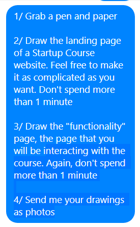
You can try it yourself if you want before seeing the results.
What I've learnt from the landing pages
1/ What I like is not what my users like
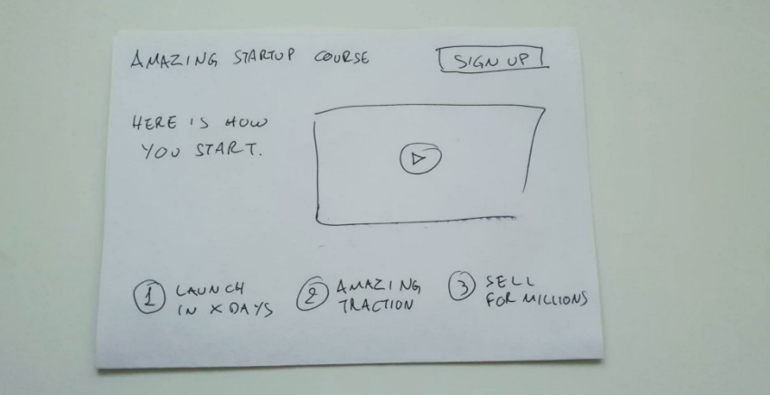
90% of the landing pages had a video/teaser which is something my design didn't have. I don't like having videos in landing pages but it seems that for educational content, it is a must.
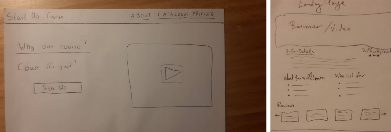
2/ Users expect discounts
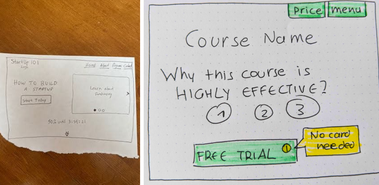
Most of the designs had a "free week" or "buy now and get X% discount". I have this too (you get most of the chapters for free) but not in that prominent space.
3/ Testimonials were not such a big theme
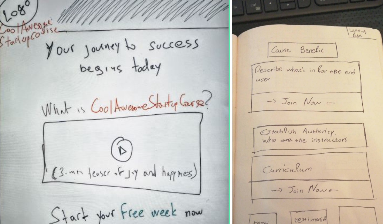
Every landing page that had testimonials didn't dedicate a lot of space to them and it was usually on the second page (under the fold). That was my wrong assumption, thinking that I needed to have a good amount of testimonials.
4/ Pay attention to interesting ideas

There were some landing pages that were 100% different from the rest. I am definitely going to integrate some ideas from them. It what makes products different, interesting and fun to use.
What I've learnt from the functional pages
5/ Video is king - but text is his Queen
Notes, action lists, descriptions and extra resources. I HAD NO IDEA. Now it makes sense. Users want more material and want to be able to go back and look at their notes.
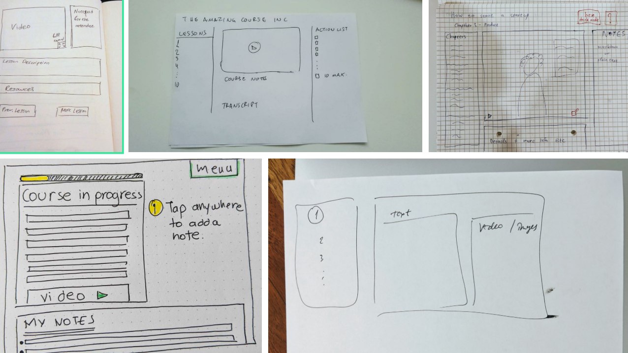
6/ Group chat and discussions
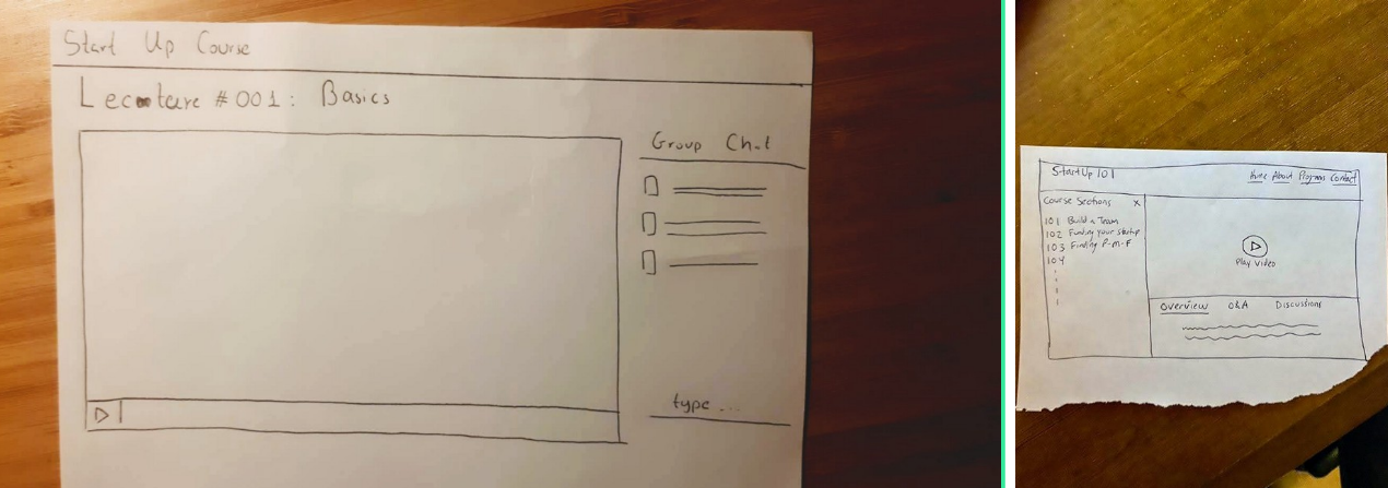
This is a much more difficult feature but it seemed important for a lot of users. I would try using Slack/Discord before building something into the product.
The Perfect User Does Not Exist
I could have built the landing user-generated landing page waaaaaay faster than the one I designed. Making assumptions and believing in them is the worst way to build a Startup.
If you want to learn how your users can use your product, eliminate all your biases. Give them a pen and paper and tell them to draw the UI. Focus on the commonality, build fast and have them try it out again.
Remember, you cannot make everyone happy. The Perfect User Does Not Exist.
A huge thanks
Goes to everyone who sent me their drawings! You get free access to the course forever :)
If you want to learn more about the course, don't forget to sign up to the mailing list.
Now go and make some products that don't exist.
Coming Next: Selling a course to change the world
- Sat 31 October 2020
Loved it?
Get weekly tips in your inbox.
Why I only invest in US-based Startups
A lot of Entrepreneurs ask me why in my list of requirements for Angel investing I only invest in US-based Startups.
The main reason is time.
I am investing in TONS of Startups and I don't have time to figure out the regulations of every country. And then the taxes …
New stories every week in your inbox!
No boring ordinary stories.